|
 | Page 1 of 2 | |  | | | | 
 | | Exclusive Interview |
By: Brendan Staunton
Page 1 of 2 It was bitterly cold and overcast in Boston as I headed down to Font Bureau's office for my appointment. Turning right out of South Station, I passed through the large dock area where the famous ship from the Boston Tea Party is moored. Walking straight on across the bridge, I found myself in the warehouse district where Font Bureau's building is located. I pressed the buzzer and headed up the stairs. Font Bureau's office is one of the handsomest industrial refits I've ever seen; the wood floors and discreet modern furnishings positively gleam with prosperity. They're unusual, as design outfits go, in concentrating on type and type-related services. Successfully too, by all accounts, and yet, if there was pressure to get work out, I was not aware of it. The atmosphere was as relaxed as I've ever encountered in a workplace. They even have an office dog. What is it with type companies and their dogs? Of all the offices I've entered down the years, only three have kept a dog and they've all been in the type business. My appointment was with Tobias Frere-Jones, just one of the company's stable of legendary type names that also includes Matthew Carter, David Berlow, Sam Berlow, Petr Van Blokland and Just Van Rossum. Today, however, the office was fairly quiet and, because Tobias had been delayed, I was shown around by Cyrus Highsmith, one of the younger designers - though already making a name for himself with such offerings as Daleys Gothic and Loupot. When Tobias arrived, the three of us sat around this low table where the interview began. | 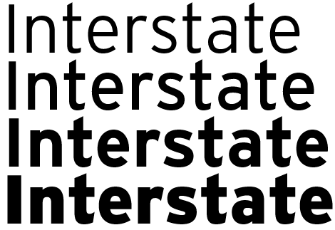 Interstate, designed by Tobias Frere-Jones, is one of the hottest fonts around at the moment. Based on the signage alphabets of the United States Federal Highway, its clarity and legibility have made it a big seller. Its origins lay in the designer's tendency to draw inspiration from very eclectic sources - anything from beer bottles (Pilsner) to children's handwriting (FF Dolores) to the Romanian inventor, Tesla (FUSE Reactor). I decided to ask Tobias about this - how, for example, could Schoenberg's music inspire a typeface? "Schoenberg had this system of writing music - the 12 tone system, where each of the 12 notes could be used in any order before moving on to the next set of 12 notes. I thought it might be interesting to apply this idea to the design of a typeface - with each of the 12 tones translated into typographic values." So you would go through the alphabet using the limitations imposed by this system. "Yes, the system creates its own coherence. The trick is to accommodate as much as you can within the tiny margin of room allowed by the strict demands you've imposed on yourself. I find that I work best with some kind of restraint. Like all the Font Bureau designers, Tobias and Cyrus mix custom work for the company's clients with their own experimentation. It seems to work well for them. As Cyrus put it: "The more custom work I need to do, the more of my own work I want to do." They obviously enjoy their work, but I wondered if they still got the same feeling from type as when they were starting out. Tobias thought about this before answering: "Well... I guess I analyse it in more detail than before, but... yes, I still get a visceral thrill from seeing well-balanced shapes." How would he define qualities like 'beauty' and 'balance' in something like type? "For me, the litmus test is to ask: how deliberate were the intentions of the designer?" And whether they come off. "Exactly. I think that's ultimately what makes it good or valuable - outside of whether you agree with it or not - that whatever the designer is attempting to do is clear." The conviction of the designer. "Yes, the clarity of intent." On the subject of whether type still affected him the same way, Cyrus related an early memory. "I remember as a kid after I'd learnt to read, I'd see all these signs everywhere and I remember thinking: 'Well, that's it now, I'm going to have to read everything - there's no going back!' Actually, though, it's not true any more. I've learned how to switch off." Cyrus may be able to switch off his reading, but not his strong opinions on type. When I asked the deliberately provocative question of whether all type was valid, he showed strong feelings. "OK, if that's what you want! I don't like to waste time arguing about whether fonts are valid or not. Basically there are certain physics involved in typefaces. You have to be able to see them; the rays of light have to go in your eyes so you can understand them. Sure, it's fun to play games with fonts and make them do tricks - I do it myself - but there are concrete things that need to happen because of the way our eyes and brains work. Beauty is part of it, but also engineering." This idea of engineering interested me. Not so long ago, type was quite literally engineered, but those days have passed and the word is now more analogous, but since type is no longer forged in molten lead, what is this engineering? What is it based on? Cyrus replied first. "It's really a multi-dimensional thing. There are principles that you fall back on, but mostly it depends on how the typeface will be used e.g. what size, who'll be reading it, how it will be printed." Having worked in various engineering offices, I remembered how the walls would be lined with volumes of official standards so that you could look up what thickness of piping you needed for a length of say 300 ft. Type design surely has no equivalent of these exacting standards? "I've often thought it should." Tobias quipped. "And that typeface designers should be licensed the way that lawyers and architects have to be." But then Cyrus brought up the 'Americans With Disabilities Guidelines for Signage' so it seems there actually were standards! However, Tobias thinks these are a good example of how guidelines didn't work. "It's hard to develop hard and fast rules because everything is really just a convention that can bend this way or that, depending on what else is going on. I could describe a lot of principles of things that should happen, but I would preface each one by saying: 'Unless something really funny's going on'. Every decision you make affects every other one, which makes it hard to separate design and engineering. Ideally, though, they should support each other." | | |
|
|
|
|
| | | Page 1 of 2 | next  |
|
|


 | Guest |  |
 |
0 items |
 |
View |
|
| Total |
|
£ 0.00 |
|  |
| |
|
| 
Receive regular e-news bulletins packed with new releases and special offers!
|
|
|
Key benefits:
- shop without c/card
- monthly invoice
- purchase history
- backup resource
- premium content
|
|
|  |
|  |
| |
|
| |
|
|


